Neobrutalism.dev
www.neobrutalism.dev- Category
- Developer Tools
- Rank
- No. 922Tools index
Previous survey · No. 915 ·
- Type
- TOOL
- Use case
- Coding
- GitHub
- 5.6k stars
- Date
About
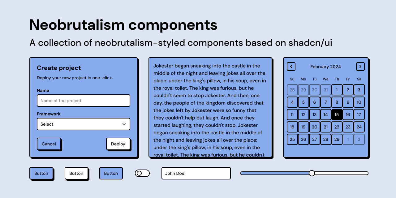
Neobrutalism.dev is a component library of 64 neobrutalism-styled UI components, charts, and star shapes for React and Tailwind CSS v4, built on top of shadcn/ui and Base UI so developers can assemble bold, high-contrast layouts with selectable color palettes.
What it does
A set of React components drawn in the neobrutalist look: thick black borders, hard offset shadows and flat loud colours. You do not install it as a package. Each component is published as a registry entry for the shadcn command line tool, so running one add command copies the component's source straight into your project, where you own and edit it. Most interactive pieces sit on Base UI for the behaviour, with Tailwind classes supplying the style. The repository itself is the documentation website that hosts those entries.
Why it's ranked here
It turns a visual style that is fiddly to get right by hand into copyable, editable source. The registry covers the full shadcn-style set, from accordion and calendar to forms, command palette, charts and resizable panels, each declaring its own npm dependencies so the add command pulls them in. MIT licensed, current stack (React 19, Tailwind CSS v4, Base UI), and nothing to lock you in once the code is in your repo. The case is narrower than a general UI kit: its value is the look, and the repository carries no tests and a placeholder contributing guide.
What's good
The button shows the design thinking in a few lines: on hover it slides by exactly the shadow offset while the shadow disappears, so it reads as being physically pressed. A reverse variant inverts that, and a no-shadow variant drops it. Sizes run from extra small to large plus four icon sizes. The card exposes a small size that tightens its spacing through one variable rather than per-element overrides. Components that need a button or dialog pull in the styled version through the registry, so dependencies arrive already themed.
Tradeoffs
The styling leans on custom theme names such as a main colour, a border colour, a shadow and a base radius, which are not stock Tailwind. Copy a component into a project without that theme and it renders unstyled in places; the files read do not show where those values are defined. Several components appear twice in the registry under a plain and an n-prefixed name pointing at the same file, which is confusing when browsing. The contributing guide says only "wip", and the build scripts include no test command.
How to use it well
Best for a marketing site, side project or portfolio that wants the bold neobrutalist look without drawing every state by hand. Start from the documentation site, set up its theme first, then add components one at a time with the shadcn command line tool and edit the copied source freely. If you already run shadcn/ui, this slots in alongside it. It does not give you a design system you can upgrade in place: once copied, fixes upstream do not reach your code unless you re-add the component.
Technical notes+
registry.json follows the shadcn registry schema and lists items of type registry:ui, each mapping to a file under src/components/ui with npm dependencies (Base UI, cmdk, embla-carousel-react, recharts@^3, react-day-picker@^9, react-hook-form plus zod) and registryDependencies given as absolute URLs to the hosted nbutton, ndialog, nlabel and ncard entries. public/r/button.json and public/r/card.json embed the full component source: button uses class-variance-authority with variants default, noShadow, neutral and reverse and translate-x-boxShadowX hover offsets; card drives padding through a --card-spacing variable switched by data-size. package.json is private, pins next 15.2.8, react 19.0.0 and tailwindcss 4.3.3, uses pnpm, and defines registry:generate and registry:build scripts but no test script. It also lists the fs and path npm placeholder packages as dependencies. velite.config.ts builds the MDX docs collection. CONTRIBUTING.md contains only "wip".
Observed
- License
- MIT (LICENSE)
- Distribution
- shadcn registry entries (registry.json, public/r/button.json); copied into your project, not an npm package
- Stack
- React 19, Tailwind CSS v4, Base UI, TypeScript (package.json)
- Tests
- No test script in package.json
- Contributing guide
- CONTRIBUTING.md contains only "wip"
- Repository role
- Next.js documentation site that hosts the registry (package.json, velite.config.ts)
Read from README.md, package.json, src/markdown/docs/index.mdx, registry.json, CONTRIBUTING.md, LICENSE, public/r/button.json, public/r/card.json, src/examples/ui/button/index.tsx, velite.config.ts.
Tags
Tech Stack
Media
Comments (0)
No comments yet
Editorially curated, with community endorsements as a secondary signal. Corrections welcome.