Bklit UI
ui.bklit.com- Category
- Developer Tools
- Rank
- No. 1396Tools index
Previous survey · No. 1401 ·
- Pricing
- Open Source
- Type
- TOOL
- Use case
- Design & Media
- Interfaces
- Web · API · SDK
- Builder
- bklit
- GitHub
- 1.7k stars
- Date
About
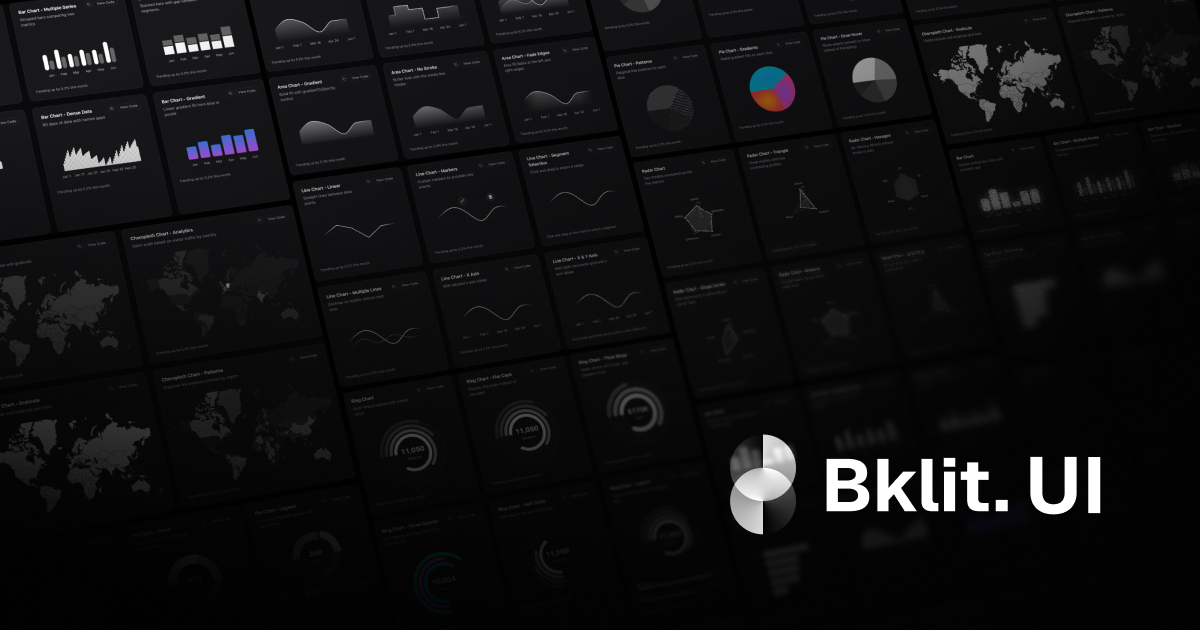
A React component library built on top of shadcn/ui that provides pre-built chart and data visualization components. It offers various chart types including line, bar, area, pie, radar, and specialized charts like candlestick and choropleth maps.
What it does
Bklit UI is a set of chart components you install through the shadcn registry: run the CLI and the source lands in your own project, ready to edit. The pieces compose, so a chart is assembled from axes, tooltips, legends, brushes and loading states rather than configured through one monolithic component. A hosted playground called Studio lets you tune a chart visually, then copy the generated React code.
Why it's ranked here
The component surface is unusually deep for a chart registry: loading skeletons for each major chart, brush selections, projection lines, a live streaming line, a heatmap system with calendar helpers, and built-in color themes with light and dark variants. That depth is the case for its position. Against it sits concentrated stewardship: the documentation credits one named author, and the Studio half of the codebase is closed to reuse. Strong components, mixed surroundings.
What's good
Composition is genuine, not decorative. Each chart exposes its internals: axis and grid pieces, tooltip parts, legend building blocks, marker groups and pattern fills, so a custom variant is an edit rather than a fork. Every major chart carries a matching loading skeleton, a state most chart libraries leave to you. The registry route means the code is yours to modify, and the repository ships scripts that verify the published registry stays in sync with the source.
Tradeoffs
The license splits down the middle: the chart components are MIT, but Studio, the editor that generates chart code, is proprietary and may not be reused, modified or redistributed. The root manifest is private, so there is no installable package; you take components through the registry or not at all. The rendering layer builds on visx, a dependency family you inherit along with the components. And the documentation names a single author as builder and maintainer, so continuity rests on one person.
How to use it well
Best fit: a React project already on shadcn conventions that needs dashboard charts with polished loading and interaction states. Start in Studio, tune a chart visually, then copy the generated code or export the registry entry and adjust from there. Treat the imported components as your own source, since updates arrive by re-adding from the registry rather than through a version bump. If you want a packaged dependency with semver upgrades, this distribution model works against you.
Technical notes+
packages/ui/src/charts/index.ts is the map of the library: it re-exports visx gradient primitives and exposes per-chart composables, including bar depth layers, ChartBrush overlays, an extensive heatmap helper set, projection-line path builders, and a profit and loss line with sign-colored segments. packages/studio/src/index.ts carries the editor surface: generateStudioCode for codegen, a compressed URL state codec, viewport presets and OG capture constants. apps/web/lib/chart-themes/index.ts defines four color themes (monochrome default, warm, forest, lagoon), each with light and dark palettes. package.json is a private pnpm and Turborepo root, Node 18 or later, with three registry verification scripts. LICENSE applies MIT to the chart packages while LICENSE-STUDIO.md reserves all rights on the Studio package.
Observed
- License
- MIT for the chart components; Bklit Studio is proprietary, all rights reserved
- Language
- TypeScript, React components
- Distribution
- shadcn registry: components are added into your project via the shadcn CLI; the repository root is a private manifest, not a published package
- Rendering foundation
- Built on visx primitives; the chart barrel re-exports visx gradient components and zoom types
- Chart coverage
- Area, bar, candlestick, choropleth, composed, funnel, gauge, line, live line, pie, radar, ring, scatter, sankey, heatmap
- Theming
- Four built-in color themes, each with light and dark palettes; monochrome is the default
- Platform
- Node 18 or later; pnpm workspaces with Turborepo
- Maintainership
- Project documentation credits a single named author as builder and maintainer
Read from README.md, package.json, pnpm-workspace.yaml, packages/ui/src/charts/index.ts, packages/ui/src/charts/choropleth/index.ts, packages/ui/src/charts/tooltip/index.ts, packages/studio/src/index.ts, apps/web/lib/chart-themes/index.ts, apps/web/content/docs/index.mdx, apps/studio-docs/content/docs/index.mdx, LICENSE, LICENSE-STUDIO.md.
What it can do
Create line charts for displaying time series data
Data array with x and y coordinates → Interactive line chart component
Generate bar charts for comparing categorical data
Categorical data with values → Bar chart React component
Build area charts for showing data trends over time
Time series data points → Filled area chart visualization
Create pie charts for displaying proportional data
Data with categories and corresponding values → Circular pie chart component
Generate radar charts for multi-dimensional data comparison
Multi-variable dataset → Spider/radar chart visualization
Build candlestick charts for financial data visualization
OHLC (Open, High, Low, Close) financial data → Candlestick chart component
Create choropleth maps for geographical data visualization
Geographic data with regional values → Interactive choropleth map component
Tags
Tech Stack
Media
Comments (0)
No comments yet
Editorially curated, with community endorsements as a secondary signal. Corrections welcome.